Business Logo
Business Logo
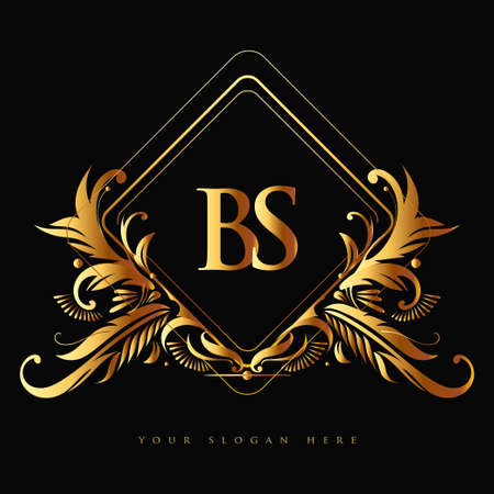
One of this first examples for my logo design. I like the design of this one because of the golden leaves around the rhombus and I also like the initials in the middle, which is something that I'm thinking about doing it for my logo. Also I like the dark background, it gives more of a mystery look to it. I think I will take the idea of putting initials in the middle for my own logo design but, the outside of the logo will be different but I'm still undecided of what my final design is going to be. 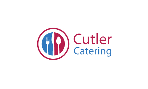
The next example is the logo of Cutler Catering. I kind of like the design of the logo, the utensils are put to the left while the name of the company to the right. I'm not sure that I like this logo, it is just to basic and simple in my opinion, there isn't much going in terms of being standout like the previous example. This one isn't as eye catching as the previous because this one doesn't have that amazing design or anything that impresses me; I'm planning to make an eye catching logo for my project, something that is going to be a standout for the project that I'm making and this example isn't one of them in my opinion.
![]()
3rd and final example is this InCareHealth logo. The logo itself is ok in my opinion, I like how the two leaves represent health and implying that the companies attentions are bringing good health to their customers by buying one of their products to treat their health. The pharmacy's name is below the logo and that's pretty much it for this one, there isn't much creativity going on with this logo as much as the first one and my inspiration for my own logo design. I would have liked if the logo was more eye-catching and creative, like I would rather prefer the leaves to surround the logo to signify good health and I would still keep the pharmacy's name below the logo.
My Logo:

This is one of my final logo designs. I got a random image of letters b and s, to represent my initials and I named it 'Bruno Singer Studios'. At first, I was making my own logo by drawing it by a mouse, it had the letters b and s in the middle but it had a shield around the letters and leaves surrounding the shield; and my name is placed below the logo. I have to say that this logo is not what I have pictured it, I could have I have made even better by making one instead of getting a Google Image of the letters b and s. I will make a few attempts to make this logo even better, like adding a layer surrounding the letters and possibly leaves around the logo itself.
.png)

.png)
.png)
.png)


Comments
Post a Comment